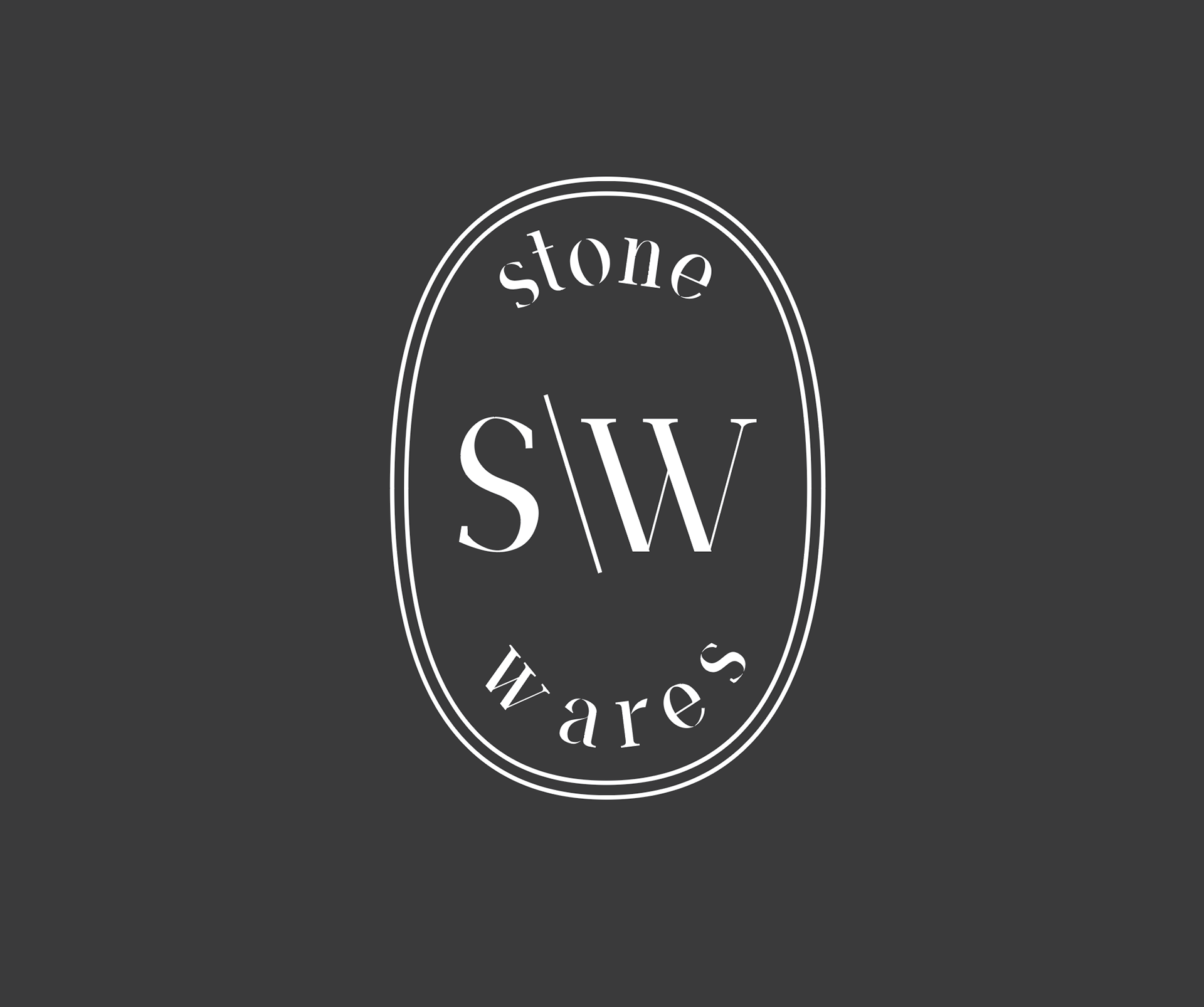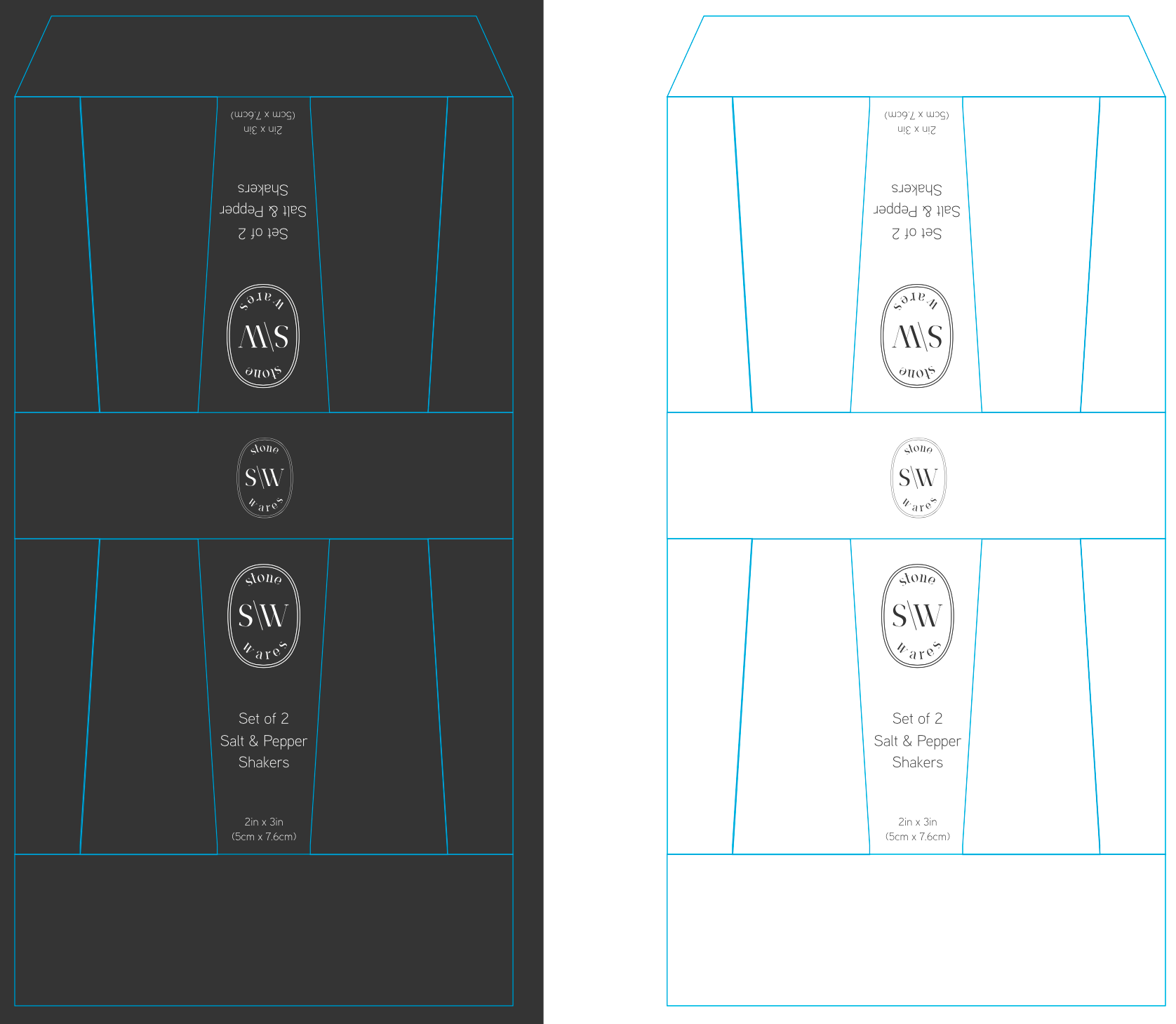
This particular branding I created for a line of stoneware products for the tabletop setting. The products themselves are stoneware, which was perfect for the brand name because I wanted to create something that had a feel of delicacy within the strength of the product. This is why the logo itself demonstrates clean lines and simplicity which contrasts the strength of the dark and light nature of the colors chosen and the minimal quality.